Portrait Mode for Data: rayshader + rayimage
(To see how I made the figure above, go to the end of the post. To learn how to make beautiful 3D visualizations with depth of field, read the whole thing. You’ll find a link to the GitHub repos with all the tools at the end of the article.)
The package discussed in this blog post was named “rayfocus”, but I eventually changed it to “rayimage” as it wrapped a more general collection of image processing utilities.
The first time I had a head shot taken, I was impressed how much more “professional” the shot looked simply by using a real camera and proper lighting. Growing up with small point-and-shoot cameras and then transitioning in the late 2000s to even smaller cell phone cameras, I was used to the “amateur” photography aesthetic: a cell phone’s short focal length and small aperture means virtually everything in the photo is in focus. Shooting with a DSLR (with its much larger aperture size and longer focal length) meant you had an actual focal plane–you could direct the viewer to focus on a certain parts of the image by creating a narrow depth of field. While losing information by “blurring” out parts of the photo, you gain the ability to “guide” the viewer through your photo.
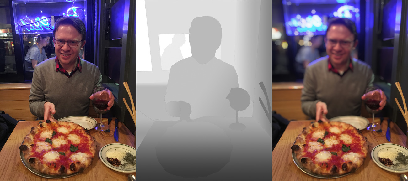
rayimage package (featuring yours truly).
This aesthetic divide also exists in 3D computer rendering: by default, most 3D software assumes an infinitely small aperture (known as the “pinhole” model) which means the rendered image has an infinitely deep depth of field. This is done because the pinhole camera model is much faster and simpler to compute than a more realistic finite-aperture camera. Because of this, real time 3D rendering (like in video games) usually doesn’t model real depth of field. This also makes it look like the image was taken with a “cheap” virtual camera–the pinhole camera is similar to the deep depth of field of a cell phone camera. Pre-rendered animations (like Pixar films) don’t need to worry about the real-time computational burden depth of field adds, so they can include it in their renders . Thus, you can get images and movies that look like they were taken with a professional camera lens.
Adding depth of field to our 3D renderer gives the image the “professional” aesthetic–less Playstation and more Pixar.
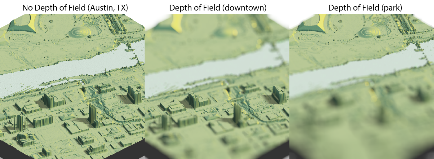
Why does this matter for 3D maps and visualizations? One issue with using 3D representations to present data is that it’s difficult to cue the reader to the important part of the visualization–especially if there’s a lot going on in the image. Thankfully, photographers and cinematographers long ago solved the problem of “How do I represent 3D space on a 2D plane and direct people’s attention to where I want it?” Which is by using depth of field to “pull focus” to where we want the viewers to look. As an added bonus, adding depth of field to our 3D renderer gives the image the “professional” aesthetic–less Playstation and more Pixar.
So how do you simulate depth of field? You need three things: an image (duh), an aperture shape, and a depth map. In a camera, objects in the background are blurry because they are no longer rendered as points, but rather as finite objects: this is known in photography as the “circle of confusion.” If we think of details in the focal plane as focusing on a single point on our sensor, objects outside the focal plane instead focus to a finite-sized area. We generate the “blur” by performing a convolution with the shape of the lens, which for an ideal “bokeh” is a circle (explaining convolution is outside the scope of this post). For a real lens, this is often a hexagon or a warped polygonal shape due to the aperture blades–but it can be any shape we want.
Convolution can be confusing when you look at the math behind it, but it’s much clearer when explained in plain English: each pixel value “spreads” to the pixels around it, in the shape of the aperture . The aperture is scaled into many different sizes for each level of blur, and a different version of the aperture is used for different distances. This is referred to as the “point spread function” for the lens: it’s a function of both the shape of the lens, and the distance to the lens (obtained from the depth map).
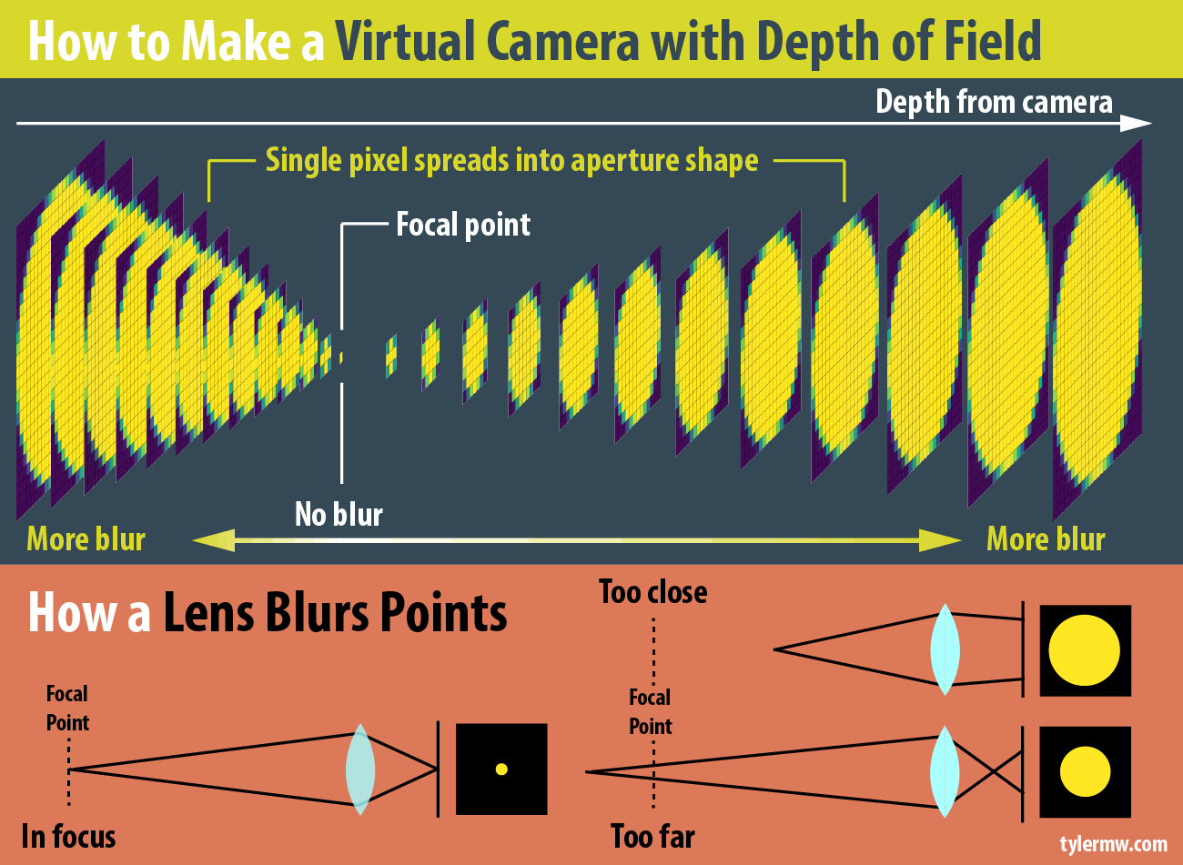
The reason why this isn’t fast to render is because this circle of confusion changes with distance : objects far from the focal point have a larger circle of confusion than those close, and the size does not vary linearly but rather varies like this (derived from the lens equation),
\[ \text{Bokeh Size} = \frac{|S_2 - S_1|}{S_2}\frac{f^2}{N(S_1 - f)}\]
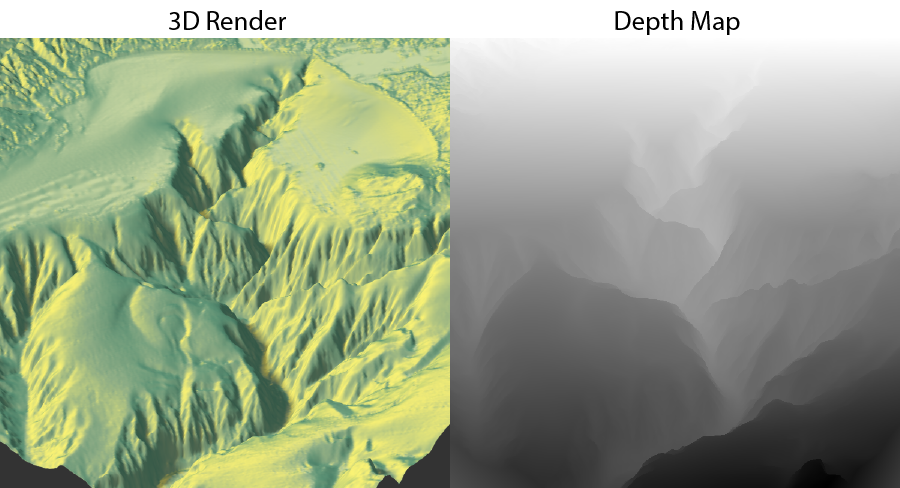
where \(S_2\)is the depth, \(S_1\) is the focal point, \(f\) is the focal length, and \(N\) is the f-stop (see this wikipedia page for more info). This equation (combined with the “spreading” process described above) is how we create our virtual camera. And luckily, we aren’t concerned with maintaining 60 frames per second when we’re visualizing data–we can bear the computational cost and just apply it as a post-processing effect. If we’re dealing with a CG image, the depth map is usually readily accessible, as it’s used by the graphics system for determining what polygons are showing. In rgl specifically, this can be accessed with the gl.pixels(“depth”) function.
gl.pixels(“depth”), and the actual rendered image. In gl, the distance will always be between 0 and 1, so our focal point must be between those two numbers. Combining this with our post-processing depth of field algorithm, we can simulate a virtual camera.
This is implemented in the latest version of rayshader in the function ender_depth(). You can adjust the focal length, f-stop, and focal distance of the virtual camera. I’ve also added advanced features that allow you to play with the bokeh intensity and supply your own aperture shape–in case you ever wanted to know what an aperture in the shape of the R logo looked like:
This is applied as a post-processing effect on the existing gl window. You simply call the function when the window is open, and it will either plot the rendered output, or save it to a file (if you specified a filename). And this works for any gl plot–not just rayshader’s output. So if you have a fancy 3D plot you’ve created with gl from another package, you can build it and then call ayshader::render_depth() to see if depth of field improves your visualization. Here’s an example of the code involved in post-processing a map with rayshader:
montereybay %>%
  sphere_shade(texture="imhof2") %>%
  add_shadow(ray_shade(montereybay,zscale=30),0.5) %>%
  plot_3d(montereybay,zscale=30,theta=-45,zoom=0.5,phi=30)

render_depth()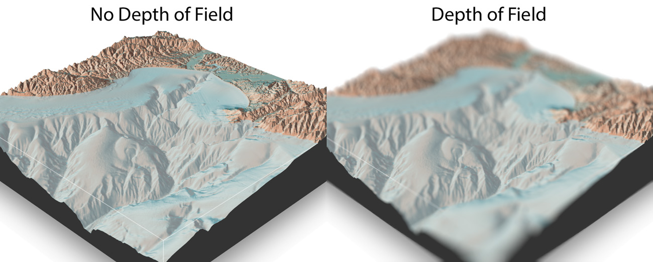
Here I show some other features, showing how to set the f-stop, focal length, focal point, increase the bokeh intensity, and change the shape of the aperture to a hexagon rotated 30 degrees (you can see the hexagons in the blurred regions):
montereybay %>%
  sphere_shade(texture="imhof1") %>%
  add_shadow(ray_shade(montereybay,zscale=30),0.5) %>%
  plot_3d(montereybay,zscale=30,theta=-90,zoom=0.6,phi=30)

render_depth(focus = 0.5, focallength = 100, fstop = 4,
             bokehintensity = 5, bokehshape = "hex",
             rotation = 30)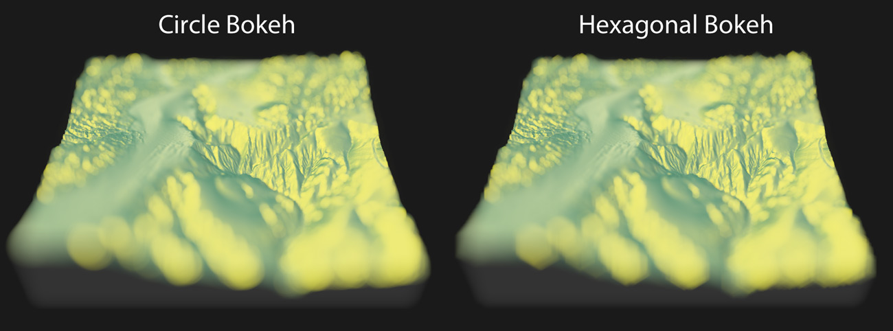
ayshader::render_depth().
I’ve also decided that it would be a shame to use this function solely for rendering images of maps, so I have created a spin-off package, rayimage, to do this with general images as well (like the pizza images you’ve seen). You supply an image and a depth map, and rayimage will use those two inputs (and your virtual camera and aperture settings) to produce a beautiful image with an adjustable depth of field and bokeh. To install, make sure you have the devtool package installed and type:
devtools::install_github("tylermorganwall/rayshader")
devtools::install_github("tylermorganwall/rayimage")
and try both of the packages.
As always, thanks for reading! Check out my newsletter to get all the latest updates as I release them, and below are the links to both the updated rayshader package and the new rayimage package:
You can download the latest versions of both rayshader and rayimage on github:
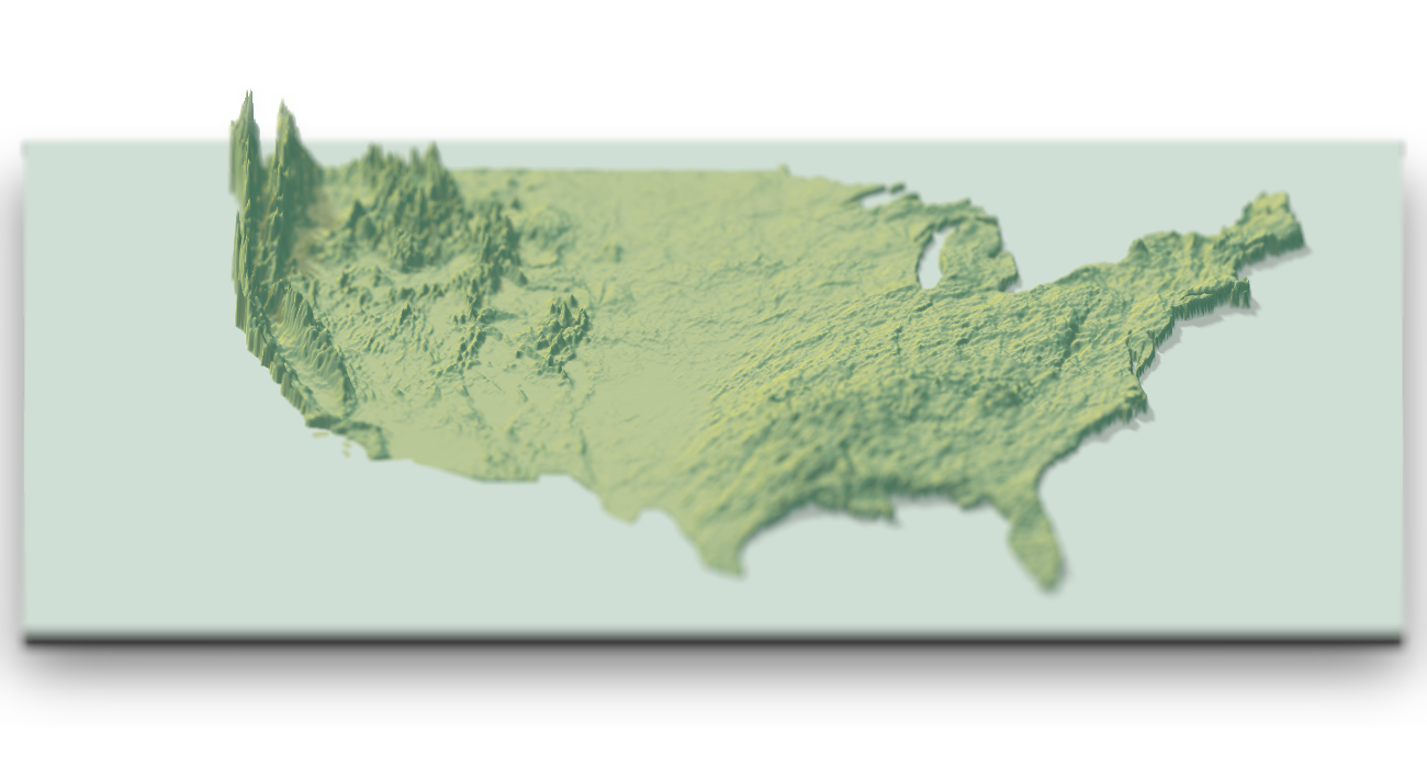
Making the Featured Visualization
I was inspired by a tweet by Rafa Pereira, who tweeted this blog post (by Garrett Dash Nelson) where the yearly snow totals were visualized as a hillshade with python. I could not find an equivalent data source readily available for precipitation, but I was able to find a website from the National Weather Service which allowed you to generate heatmaps of the daily precipitation totals. I then wrote an vest script to query this service and download the daily images. These images also included watermarks, so I cropped them using imagemagick. I also downloaded a blank map from the website to extract an aligned outline of the US to mask the non-land areas (since the radars covered water as well). By setting all the land area to 1 and the water to 0 and element-wise multiplying that with the elevation maps, I ensured we were only covering the land regions. I also used this mask to set a water color with the add_water() function in rayshader.
Once I had all the data, I used an eyedropper tool in an image editing program to determine the RGB values associated with each level of precipitation. I then wrote a short function to map those values to an elevation matrix. Between precipitation levels there were non-matching interpolated colors, so I set those all as NAs and used the zoo::na.approx() function to interpolate the missing regions. Each day was added to the last to get the total precipitation to that point, and then visualized by passing in the total rainfall elevation matrix into rayshader. The depth of field was simply added by calling ender_depth() after the gl 3D plot had been built.