Introducing 3D ggplots with rayshader
As rayshader gracefully rotates into its second year, I’m happy to announce the release of a feature I’ve been teasing for a while: 3D ggplots! It’s been a long time coming, but the wait was worth it–I promise. Creating this feature was a logical extension of rayshader’s core competency–using elevation matrices to generate raytraced 3D maps of topographic data. Specifically, this tool generates 3D visualizations by transforming the color or fill aesthetics already defined in a ggplot2 object into the third dimension, and then maps the original plot onto that 3D surface.
How does one go about creating a 3D ggplot? Do I have to learn a completely new interface to create 3D plots? And wait, isn’t 3D plotting bad? Continue reading to find out!
Note: Each visualization in this article is accompanied by the code used to create it (the code for the featured video above is at the end of the article)–once you install the latest version of rayshader from Github, you can run the code below and immediately start playing along with me. Try it out! (note: Mailing list subscribers, the package will be out on Tuesday–come back and try the code then!)
remotes::install_github("tylermorganwall/rayshader")
library(rayshader)
library(ggplot2)
library(tidyverse)

gg = ggplot(diamonds, aes(x, depth)) +
  stat_density_2d(aes(fill = stat(nlevel)),
                  geom = "polygon",
                  n = 100,bins = 10,contour = TRUE) +
  facet_wrap(clarity~.) +
  scale_fill_viridis_c(option = "A")
plot_gg(gg,multicore=TRUE,width=5,height=5,scale=250)
fill or colo, even when facetted. The user can create animations by moving the camera using rayshader’s ender_camera() function. Or, the user can twirl the graph around interactively, and take single snapshots with ender_snapshot(). By default, rayshader provides an isometric view of the graph, but you can add perspective by setting the field of view (argument fov) to a positive value.
My primary goal was not just to provide a hacked-together utility for generating these plots–I wanted to make the interface as user-friendly as possible. I wanted a 3D plotting package that didn’t require teaching users a new workflow or complex 3D modeling software just to produce a 3D plot; this feature is immediately accessible to anyone that already knows how to use ggplot2.
And due to this desire for simplicity and ease of use, this implementation of 3D graphing is not a new 3D grammar of graphics. All of the graphing is still driven by ggplot2–rayshader just takes those objects and maps them to 3D.
To transform an existing ggplot2 object into 3D, you simply drop the object into the plot_gg() function–rayshader handles the dirty work of stripping out all non-data elements, remapping the data, ray tracing shadows, and plotting it in 3D[footnote]Utilizing the gl package[/footnote]. And this works with any ggplot that includes a color or fill aesthetic, no matter the complexity[footnote]Intended to work–if you find examples where it doesn’t, leave an issue on the Github issues page[/footnote].
#Data from Social Security administration
death = read_csv("https://www.tylermw.com/data/death.csv", skip = 1)
meltdeath = reshape2::melt(death, id.vars = "Year")

meltdeath$age = as.numeric(meltdeath$variable)

deathgg = ggplot(meltdeath) +
  geom_raster(aes(x=Year,y=age,fill=value)) +
  scale_x_continuous("Year",expand=c(0,0),breaks=seq(1900,2010,10)) +
  scale_y_continuous("Age",expand=c(0,0),breaks=seq(0,100,10),limits=c(0,100)) +
  scale_fill_viridis("Death\nProbability\nPer Year",trans = "log10",breaks=c(1,0.1,0.01,0.001,0.0001), labels = c("1","1/10","1/100","1/1000","1/10000")) +
  ggtitle("Death Probability vs Age and Year for the USA") +
  labs(caption = "Data Source: US Dept. of Social Security")

plot_gg(deathgg, multicore=TRUE,height=5,width=6,scale=500)heighttype = “color”.
Once open, the plot can be manipulated like any other rayshader plot–you can call ender_camera() to programmatically change the camera position, ender_snapshot() to save or output the current view, or even use ender_depth() to render a slick depth of field effect (I wrote about depth of field and its use in 3D visualization in my previous blog post–check it out at some point). You can also change or even remove the light source, and pass any arguments to plot_gg() that you would plot to plot_3d().
library(sf)

nc = st_read(system.file("shape/nc.shp", package="sf"), quiet = TRUE)
gg_nc = ggplot(nc) +
  geom_sf(aes(fill = AREA)) +
  scale_fill_viridis("Area") +
  ggtitle("Area of counties in North Carolina") +
  theme_bw()

plot_gg(gg_nc, multicore = TRUE, width = 6 ,height=2.7, fov = 70)
render_depth(focallength=100,focus=0.72)ender_depth() function in rayshader. This is more than just visual fluff: photographers and cinematographers solved the problem of “directing attention in a 3D world projected on a 2D screen” a century ago, and that solution is depth of field. However, when you start getting really cinematic, it’s best to also provide a non-Spielbergian version of your plot.
The output produced by rayshader is effectively a 2.5D plot, so sharp transitions will sometimes (not always!) contain unwanted color mixing between the low and high areas. You can get around this in two ways: cover it up, or increase the resolution of your plot. For the fill aesthetic, you can cover up sharp transitions between points by giving the layer a line color–here, I added a black line to the hex plot, which covers all the transition regions.
a = data.frame(x=rnorm(20000, 10, 1.9), y=rnorm(20000, 10, 1.2) )
b = data.frame(x=rnorm(20000, 14.5, 1.9), y=rnorm(20000, 14.5, 1.9) )
c = data.frame(x=rnorm(20000, 9.5, 1.9), y=rnorm(20000, 15.5, 1.9) )
data = rbind(a,b,c)

#Lines
pp = ggplot(data, aes(x=x, y=y)) +
  geom_hex(bins = 20, size = 0.5, color = "black") +
  scale_fill_viridis_c(option = "C")
plot_gg(pp, width = 4, height = 4, scale = 300, multicore = TRUE)

#No lines
pp_nolines = ggplot(data, aes(x=x, y=y)) +
  geom_hex(bins = 20, size = 0) +
  scale_fill_viridis_c(option = "C")
plot_gg(pp_nolines, width = 4, height = 4, scale = 300, multicore = TRUE)
For the colo aesthetic, plot_gg() has a built-in option to shrink the size of the points slightly when mapping points to 3D. Play with this value if you’re using geom_point() and have unwanted color mixing at the transition regions.
mtcars_gg = ggplot(mtcars) +
  geom_point(aes(x=mpg,color=cyl,y=disp),size=2) +
  scale_color_continuous(limits=c(0,8)) +
  ggtitle("mtcars: Displacement vs mpg vs # of cylinders") +
  theme(title = element_text(size=8),
        text = element_text(size=12))

plot_gg(mtcars_gg, height=3, width=3.5, multicore=TRUE, pointcontract = 0.7, soliddepth=-200)mtca dataset using geom_point(). plot_gg() includes the option to slightly shrink points around their center with the pointcontract argument. This covers up the transition region between the plot background color and the point color by shrinking the 3D data within the color bounds.
You can also just increase the resolution of the plot (by increasing the idth and height arguments), which will help smooth out all these issues.
If the defaults in plot_gg() don’t appeal you to you, there are ways to customize the 3D output. You can change the 3D scaling, adjust the light position or intensity, or manipulate the underlying shadow and background color the same way you would in rayshader’s ay_shade() function. If the built-in ggplot-to-3D conversion isn’t to your liking, you can pass in a list of two ggplots–the first will be the displayed plot, and the second will be used to generate the 3D surface (also, file an issue on the rayshader Github if it’s not working–there are way too many corner cases in ggplot2 for me to have figured all of them out on my own).
#Generate the ggplot2 objects for both the 3D depth
#information (ggplot_potential) and
#for the plot painted on that surface (ggplot_objects).
#Combine these into a list and pass into plot_gg()
#instead of a single plot, and you can "paint"
#the 3D surface generated by one plot with the texture of another.
ggplot_potential = generate_ggplot_potential()
ggplot_objects = generate_ggplot_orbiting_objects()

plot_gg(list(ggplot_objects, ggplot_potential), height=5, width=4.5)
The ability to specify the 3D surface separately from the plot itself is more than for bug workarounds. You can also use this feature to plot a visualization where where depth serves as it’s own variable, separate from color. Want to show a hillclimbing algorithm getting stuck in a local maxima? Or the locations of watersheds visualized with real geographic features? How about a toy model of how the curvature of spacetime results in moving objects orbiting? All this is not only possible, but incredibly simple with rayshader’s plot_gg() function.
But wait–aren’t 3D plots bad?
“But wait!” you ask. “I thought 3D plotting was bad. Do you really want to open Pandora’s 3D box chart?”
3D has a poor reputation in the data visualization community, and I’ll point to a great new resource that describes why: Claus Wilke’s book “Fundamentals of Data Visualization” has a great chapter titled “Don’t go 3D.” His advice is less black and white than the chapter title implies, but he brings up two good points an analyst/researcher should consider before using a 3D plot. I have not included those points verbatim: here’s my takeaway of the main points from that chapter, and what rayshader does to help avoid those pitfalls.
- Don’t use gratuitous 3D: Does your data have three variables, each with a continuous numeric mapping? If the answer is “no”, then you shouldn’t use 3D. This is by far the biggest offender in poor use of 3D[footnote]Thanks Excel[/footnote].
Rayshader’s implementation of 3D plots explicitly avoids this: in order to generate a 3D plot, you must have an existing continuous color mapping in the original plot (if you attempt to use a discrete data point mapped to a color, plot_gg() will throw an error). Any gratuitous 3D must then be hard coded by the user. And if someone just needs to have their 3D pie chart, who am I to question their intentions? They may have their reasons (most likely bad, but who knows), and if they put in the work to hack together an objectively “bad” visualization: well, bless their heart.
And not all 3D is gratuitous–the spacetime plot above shows that depth can be a more effective tool than any other (color, contours, vector lines) in telling a specific kind of story.
- It’s difficult to interpret static 3D visualizations, as the display is an inherently 2D medium and the reader can’t accurately reconstruct the depth information of 3D data. Any 3D visualization that has “floating” objects, such as 3D scatter plots or 3D line plots, suffers from this problem. And even if 3D objects are well-grounded, adding perspective makes it difficult to compare different data points.
Rayshader addresses these problems in a few ways: first, rayshader defaults to an isometric 3D projection, which preserves areas, relative lengths, and angles. This means that the 3D does not distort the data–isometric projection the same technique used in 3D CAD software when there is a need to accurately represent 3D objects in 2D. Secondly, all the data is “grounded” in rayshader; Since the plots rayshader produces are effectively 2.5D rather than fully 3D (each x/y point is only associated with a single z point, and those points are all connected), the continuous underlying substrate provides perceptual context for the missing depth information. The issue of “small box close, or big box far away?” doesn’t occur with a 2.5D plot, since those points can always be located in 3D space by referencing the surrounding data.
Depth can be a more effective tool than any other (color, contours, vector lines) in telling a specific kind of story.
In my opinion, 3D visualization mostly gets a bad rap because the available tooling has never properly supported it. Excel exclusively produces 3D visualizations of the “gratuitous” variety. Engineering-focused programs like MATLAB tend to generate plots that are functional but aesthetically… well, made by an engineer (apologies to all the artistic engineers out there). Python and other languages (R included!) mostly treats 3D plotting as a toy–offering some basic utilities to support it, but not (again, in my opinion) enough to support serious work. And a good portion of academic 3D plotting utilities aren’t focused around data–they are more built around displaying mathematical surfaces that can be defined by equations.
This lack of support forces those who want a beautiful 3D plot to exit the world of programming and enter the completely skill-orthogonal world of 3D modeling. Learning about programming, data science, and data visualization is hard enough: we don’t need to add Blender to the list.
I know there’s someone thinking right now: “If the color data is already there, why bother with a 3D mapping? Isn’t this mapping by definition gratuitous if the color is already present?” If you thought that, here are your brownie points[footnote]Spoiler: There are no brownie points. [/footnote]. However, 3D mappings have some advantages over traditional color plots. The advice to always use a color plot is not nearly that simple: There are physiological aspects of color perception that might need to be taken into account when presenting a color mapping. There’s the obvious issues, like color blindness. Then there are more subtle issues, like how linear some palettes are perceived, or how some colors have specific meanings in certain areas of the world which may change the visualization’s context.
Learning about programming, data science, and data visualization is hard enough: we don’t need to add Blender to the list.
There’s also the issue of interpretability: researchers know how to interpret a color plot, but how should a layperson know that green is half of yellow, both of which are higher than purple? Professionals know to look to the color bar to provide the needed context, but not all laypeople immediately know how to interpret a heatmap. And even if you do, often it’s best to bin continuous variables into large discrete intervals because it’s hard for our brains to map those colors back to their numeric values with any degree of fidelity. If your story is “high concentration of X variable here, and low concentration elsewhere” do you need the precision offered by a color plot? Not always.
A 3D plot is a just another tool that enables the reader to compare relative magnitudes across space. In an interactive or rotating 3D plot, a user can compare relative magnitudes as easily as they would two objects if placed in front of them. Yes, the reader loses the ability to exactly map the presented data back to its numeric value. But the point of a good data visualization isn’t the ability to re-construct the original data set based on the figure’s RGB values–it’s to tell a story. And in some cases, a 3D plot is a better and more engaging tool to do just that.
Ready to get started? Check out the links below! The website contains documentation and examples of all of rayshader’s functionality, and you can find the actual repository on the Github page.
And if you liked this post, be sure to follow me on Twitter and sign up for my newsletter!
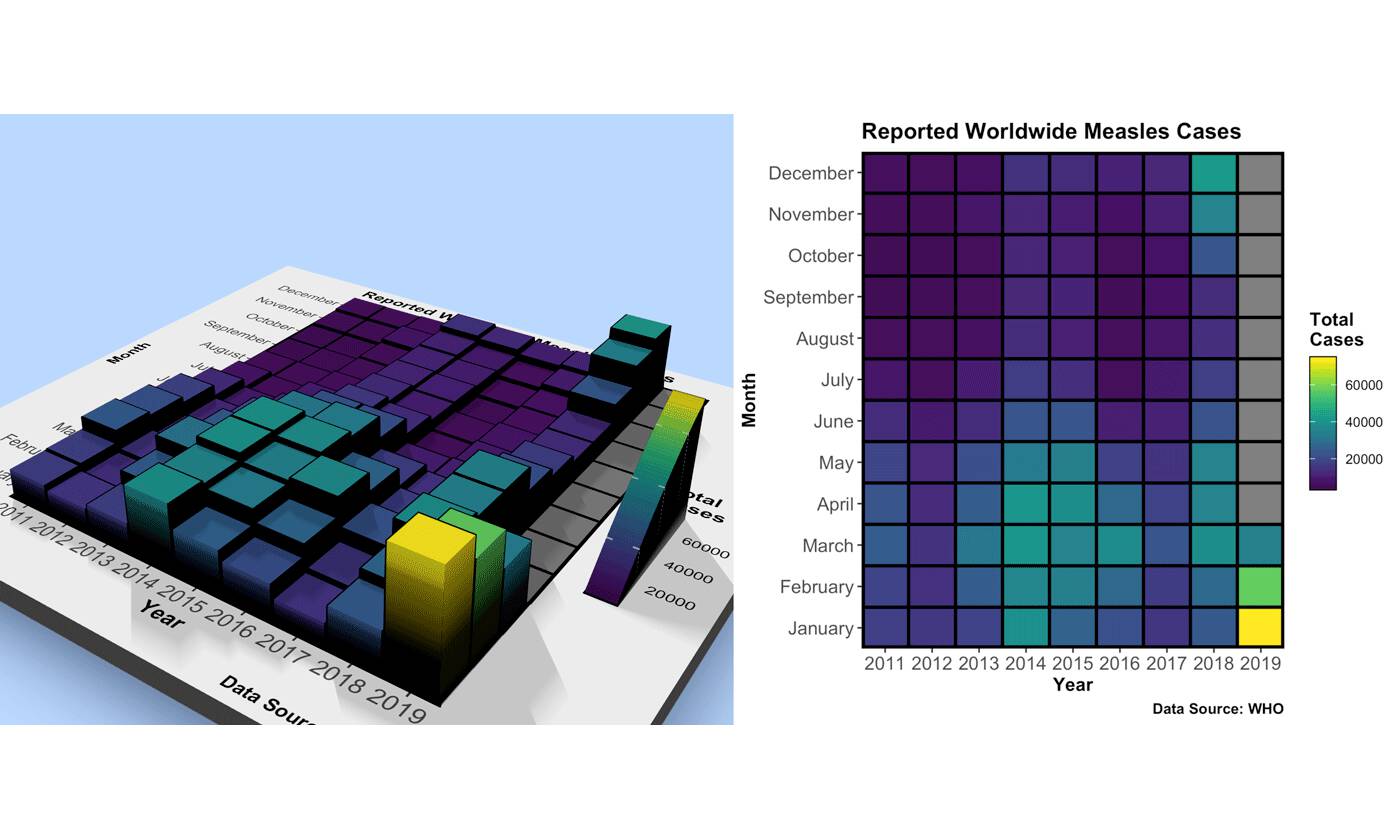
Code for featured figure at the top of the page
library(tidyverse)
measles = read_csv("https://tylermw.com/data/measles_country_2011_2019.csv")
melt_measles = reshape2::melt(measles, id.vars = c("Year", "Country", "Region", "ISO3"))
melt_measles$Month = melt_measles$variable
melt_measles$cases = melt_measles$value
melt_measles %>%
  group_by(Year, Month) %>%
  summarize(totalcases = sum(cases,na.rm = TRUE)) %>%
  mutate(totalcases = ifelse(Year == 2019 & !(Month %in% c("January","February","March")), NA, totalcases)) %>%
  ggplot() +
  geom_tile(aes(x=Year, y=Month, fill=totalcases,color=totalcases),size=1,color="black") +
  scale_x_continuous("Year", expand=c(0,0), breaks = seq(2011,2019,1)) +
  scale_y_discrete("Month", expand=c(0,0)) +
  scale_fill_viridis("Total\nCases") +
  ggtitle("Reported Worldwide Measles Cases") +
  labs(caption = "Data Source: WHO") +
  theme(axis.text = element_text(size = 12),
        title = element_text(size = 12,face="bold"),
        panel.border= element_rect(size=2,color="black",fill=NA)) ->
measles_gg

plot_gg(measles_gg, multicore = TRUE, width = 6, height = 5.5, scale = 300,
background = "#afceff",shadowcolor = "#3a4f70")